
Beauty Vibe Identity
Beauty Vibe desired to expose themselves out to the world with their concept of the brand. Beauty Vibe reached Wildkop so that we could work together on their brand identity.

Color pick
Main color: Almond
Secondary color: Black Shadows
Suportive dark color: Black Olive

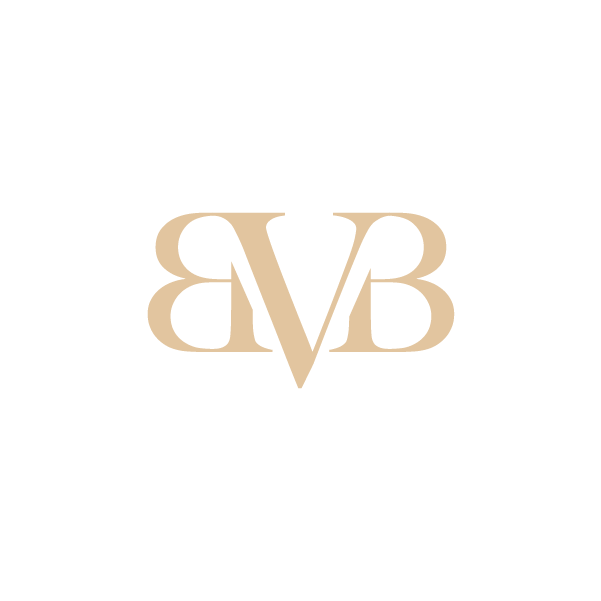
The symbol is a combination of the two main letters that form Beauty Vibe. We decided to give Beauty Vibe this letter representation to identify their position as an elegant and contemporary company.

The font that we wanted Beauty Vibe to identify with is a traditional font with thin and simplistic lines.
The chosen font is a perfect fit to establish a solid foundation for the company in bringing forward a confident expression in their specific market.

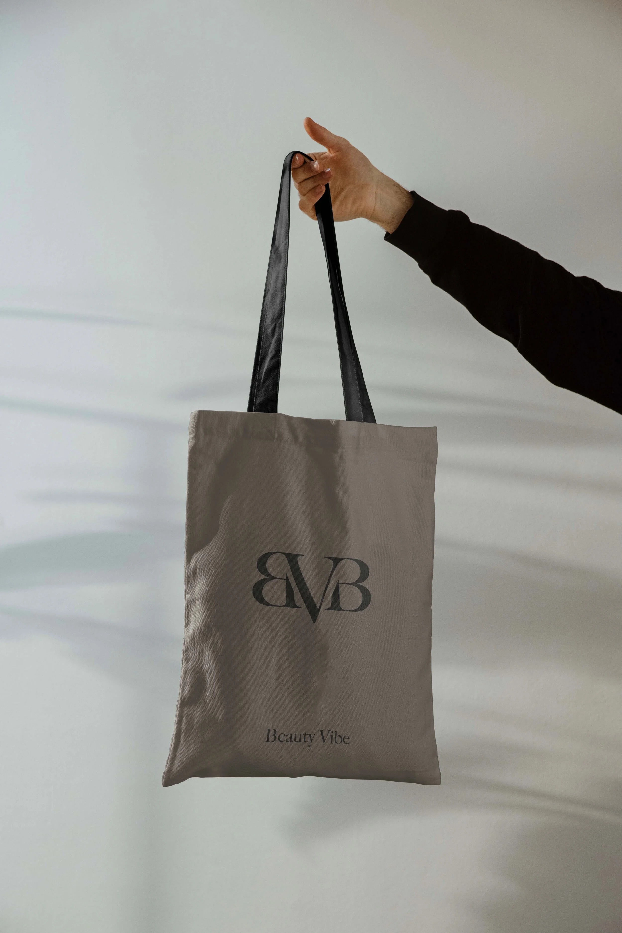
Show off your preferred beauty clinic with their branded tote bag.

Exhibiting in a highlighting way with a focus on the visual elements.
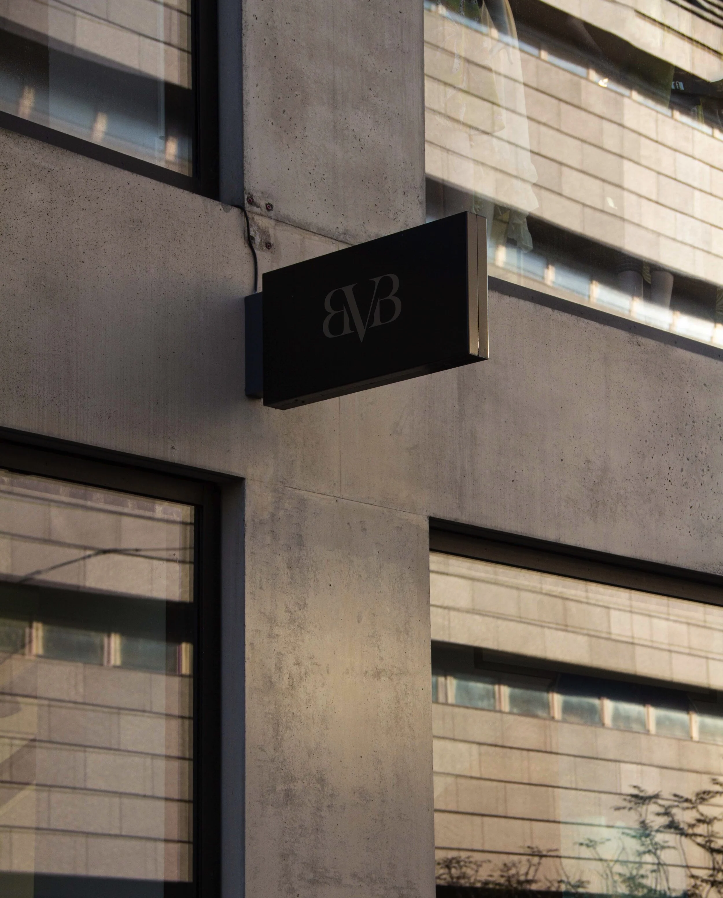
Signage concept focusing on dark tones to give a traditional strategic feel.

Raising higher than other competitors with a solid brand in the beauty market is relevant for both founder and client.
“After having followed Franckcoz on social media for a while, I decided to reach Franck Coz Studio so that they could help produce a complete identity for my new company. I was so eager to receive a couple of drafts after reviewing my ideas, position and goals for my company, and these exceeded all expectations!
We had a good dialogue on the whole process, and I felt that they gave me educational pointers on why and how the logo is built and how it should be fronted.”
-Celina Tello - Founder of Beauty Vibe

Our co-working pathway with Beauty Vibe.
We had a blast working with the Founder of Beauty Vibe, Celina Tello, on her vision to expose her brand to the next step. We did solid research on how the beauty market is exposed in the modern world. During the process of creation, we kept in mind that beauty is a traditional ritual that has existed for ages, and that the core values needed to be respected.
With these ideas and thoughts in hand, we came up with a symbol and wordmark that best fitted her vision on simplicity and on a timeless feel for her brand.
The colors chosen for the symbol and wordmark are inspired by a classy and victorian feel, which will help attract both existing and new customers.
