
Take a peak on the road of creating the identity of a coffee brand and maintaining its identity. Focusing on heritage, responsibility, traditions and unification. All this was taken in mind when creating their symbol, naming and wordmark.

Main Logo
Symbol & wordmark


Symbol
Main symbol with its two main colors implemented.
Wordmark
Wordmark in focus with its main two colors.


Custom font
Custom font based on the system font of the brand.


Symbol and wordmark
Main wordmark and symbol together. The following usage is the main practice of the brand's logo.


Logo weight
Wordmark and symbol jointly. The following usage is the main procedure of the brand's main logo.


Complementary symbol
The complementary symbol for support usage on content, pattern, or merchandise for greater exposure.

Wordmark compound
The components were the main influence to identify the brands feel and identity towards its core values.


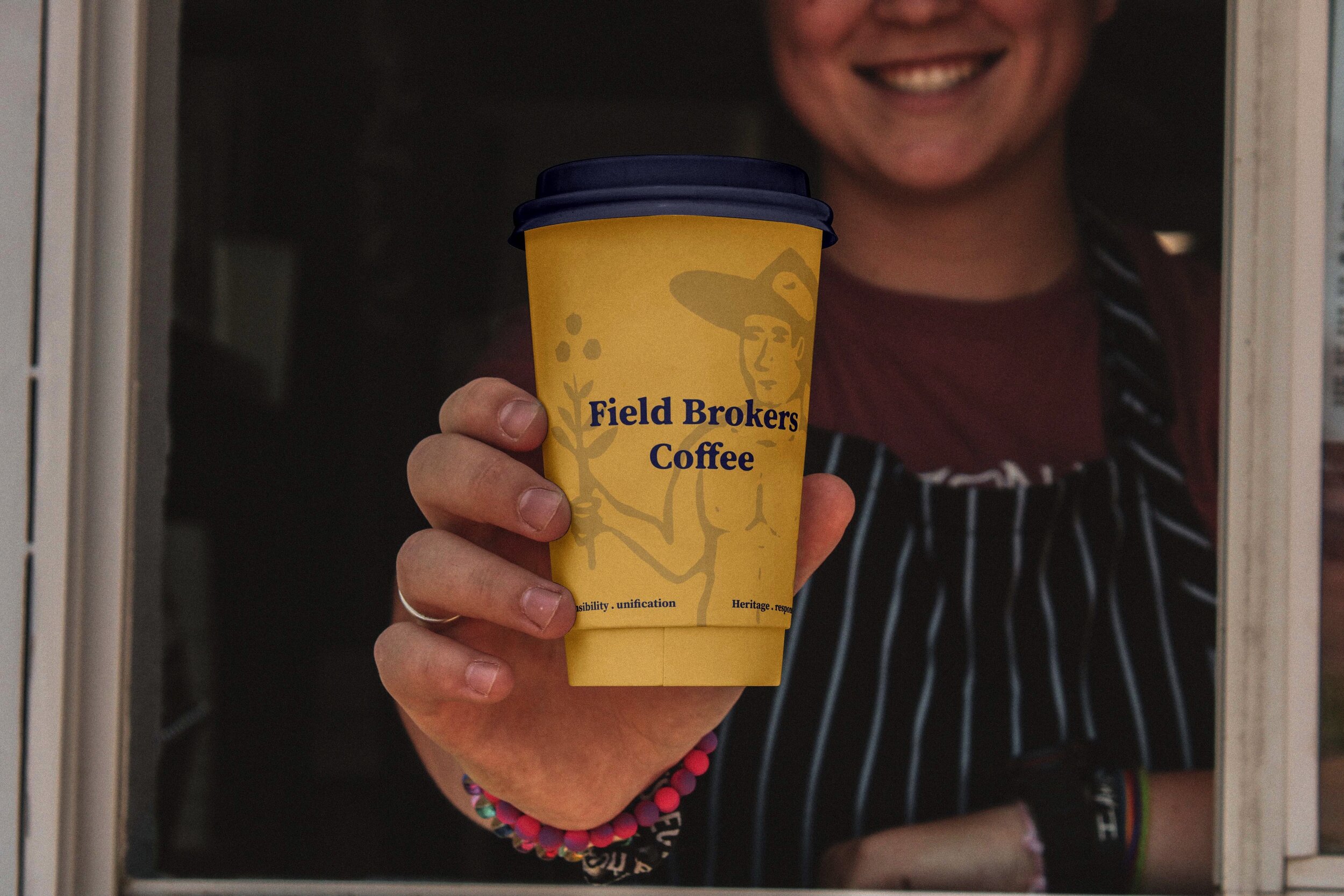
Even the smallest cup presents the details and the responsibility of the brand and its identity.

Why not exhibit your passion for coffee in the outer world?


Complementary main symbol
Complimentary use of the main symbol to support appearances or presentations.


Implementation
Identity practice on coasters, business cards and signage.

Teaser intro
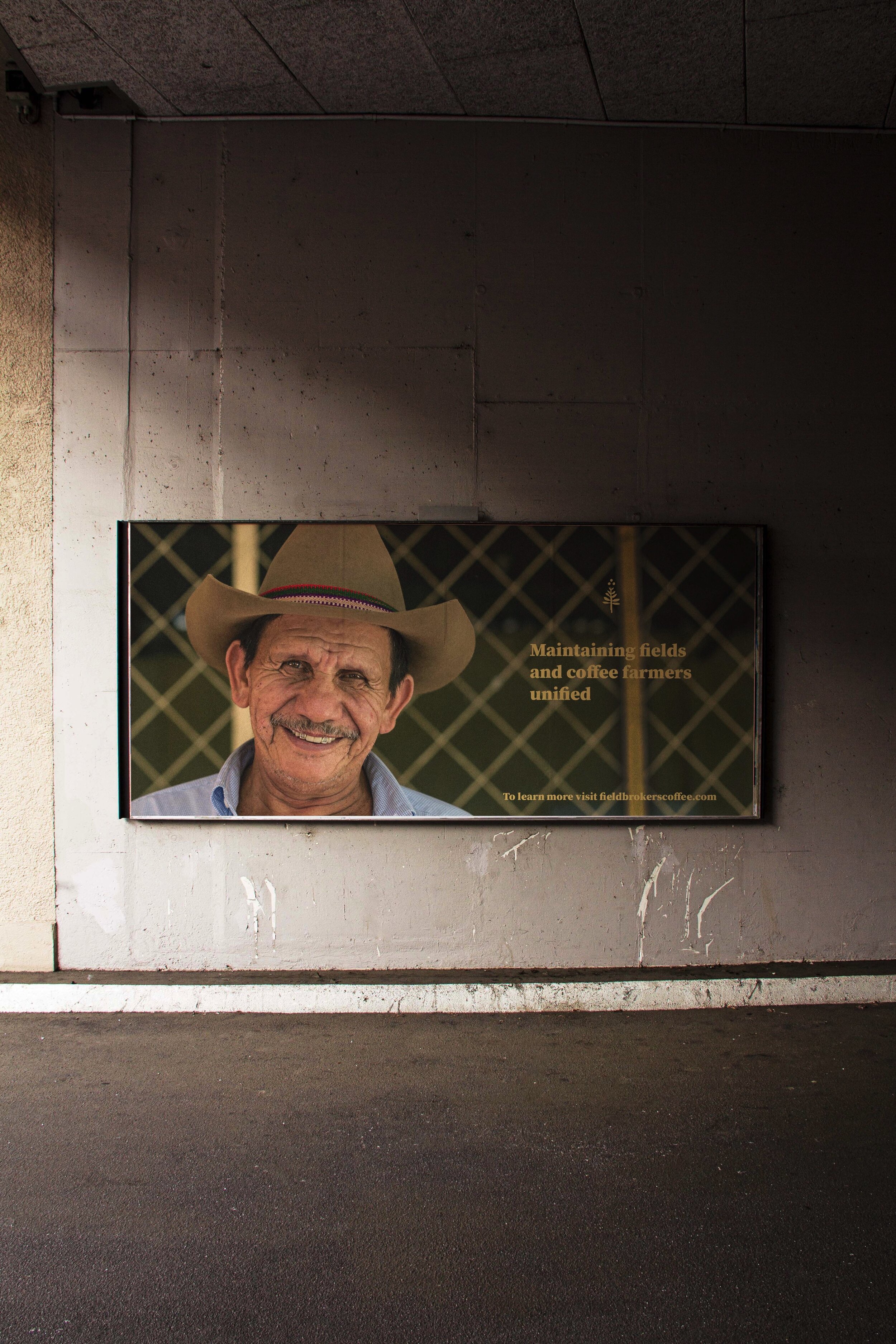
Signage concentrating on the brand's message on its core values


Field Brokers Coffee identity path
This personal concept was developed from a wish to create a sustainable brand that supports local farmers around the world maintaining its heritage, responsibility, traditions and unification.
The focus of Field Brokers Coffee's identity is to display the name and feel like a rough and natural brand that has its bonds to the earth and its roots. The symbol expresses the hard-working farmer with a relationship to the coffee plant on his left and a bond to the earth to his right.
The wordmark is directly motivated by its core values on how the field farmers share their field and knowledge. If a crop needs assistance or guidance, other unified farmers will step in and assist this specific farmer or crop.